NorthPointe Punjabi Church


A new proposed logo for our Punjabi language church. The old logo was just the english version, but in a Gurmuhki font. This new version follows the guidelines of the existing logo and style with an all new icon and a custom wordmark.
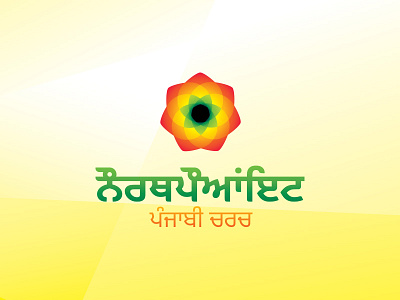
The lotus was chosen for it's historical connections to India. This one is 7 sided, the symbolic Hebrew number joining God (3) and man (4).
I chose vibrant colors mainly because, when I look at art and graphics and fashion from India, they usually seem to be quite saturated and loud. The yellow/green transition is meant to reflect the relationship between the Punjabi church and the logo refresh for the main English branch, which will also be yellow and green. The red, however shows that it is also distinct. Finally, the wordmarks were set in green and orange, the colors of the national flag of India. All of this was done to attract Punjabi visitors by reminding those who emigrated from India of their homeland.
Note that the text may not be correct, I'm still waiting on feedback and the words could have some minor errors.


