Looks awesome, but the "i" in Giant looks sorta like an "r", making it read "Grant pea." Might just be me, but thought I'd throw that out there. You could probably avoid that by not having the "G" and "i" connect.
Alex disconnecting the "G" from "i" will break the whole rhythm of the word. Honestly I don't think this "i" looks like an "r". Anyway thank you for your words and suggestion.
22 Responses
Pro
Sergey Shapiro
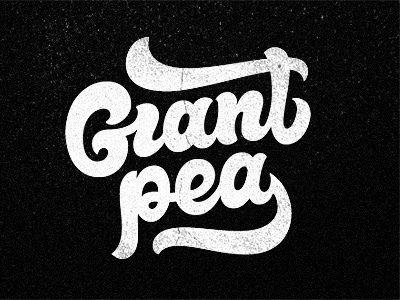
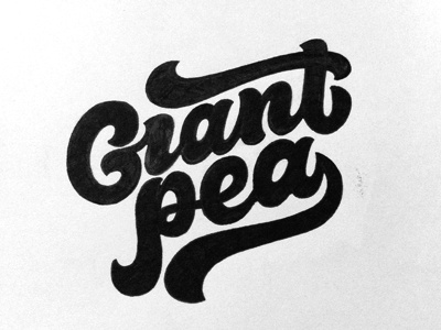
Next round.
Fixed. Tilted with a small angle, different swooshes....bla bla bla...Textured for fun.
WIP.
over 1 year ago
WIP!? I say its gold!
over 1 year ago
Pro
Sergey Shapiro
Yeah, I marked it WIP since it hadn't been approved (just sent it to the client). Thank you Preston!
over 1 year ago
So sexy.
over 1 year ago
So good !
over 1 year ago
Pro
Sergey Shapiro
David, Erik thank you dudes!
over 1 year ago
Pro
Evan Huwa
So awesome dude!
over 1 year ago
Pro
Luis Lopez Grueiro
Love all your work!!
over 1 year ago
Pro
Timothy ッ
Love it, great final version! Smashed it!!
over 1 year ago
Pro
Simon Frouws
Turned out brilliantly. Great overall balance. Wow.
over 1 year ago
Pro
Norman Chan
A Giant Thumbs Up!
over 1 year ago
Pro
Milosz Klimek
I feel teeny tiny looking at this logo.
over 1 year ago
Pro
Jovan Petrić
Better! I love G improvements.
over 1 year ago
Pro
Sergey Shapiro
Thank ya all for your comments buddies!
over 1 year ago
Pro
Joonbug
schweeet
over 1 year ago
Pro
Alex MacDuff
Looks awesome, but the "i" in Giant looks sorta like an "r", making it read "Grant pea." Might just be me, but thought I'd throw that out there. You could probably avoid that by not having the "G" and "i" connect.
Love the look of this, though. Nice work.
over 1 year ago
Pro
Sergey Shapiro
Alex disconnecting the "G" from "i" will break the whole rhythm of the word. Honestly I don't think this "i" looks like an "r". Anyway thank you for your words and suggestion.
Thanks @Fresh Kaufee.
over 1 year ago
Great to see the final of this, it came out beautifully! Love the balance between the top and bottom strokes.
over 1 year ago
Pro
Florin Capota
dig the updates, looks great
over 1 year ago
Pro
kirk visola
I agree with Alex. I thought it said Grant. Small nitpicky thing. This looks great. Really nice
over 1 year ago
Pro
Rogie
Excellent looking work. I read "Grant" at first :(
over 1 year ago
Rebound
Giantpea
by Sergey Shapiro
Going further with a new concept. Don't ask why:)
No brush pens, just drawn with G1 Pilot gel pen.
over 1 year ago