Contact page

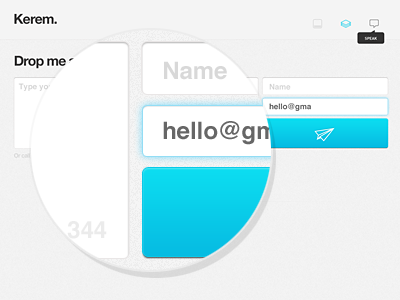

This is supposed to be the contact page, yes it is 1140px wide, I like big fat form elements. Check out the full-size image for more details and follow me on twitter for updates.
This is supposed to be the contact page, yes it is 1140px wide, I like big fat form elements. Check out the full-size image for more details and follow me on twitter for updates.


