Kubernetes Survey Infographic


Viewers are 38% more likely to find your data credible if you use donut graphs and pretty colors.
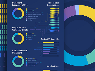
Seriously though, this survey was solid. Check it out.
Viewers are 38% more likely to find your data credible if you use donut graphs and pretty colors.
Seriously though, this survey was solid. Check it out.


