Quick idea: what do you think about switching the "is for" so that it curves around the circle shapes at the top? Basically, you would just slip the curve of the text.
?
That's a good idea, Nate, I'll give it a whirl. What do you think about the A bug and the rest of the crest being separate? Should they be layered on top, like the A is a button glued on the crest (for lack of a better description)?
I guess I would have to see it, but I like what you have here. I think that your layout here connects all of the elements together but still has separation and a sense of hierarchy.
5 Responses
Pro
Ryan Lascano
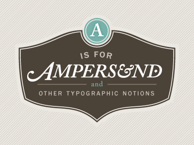
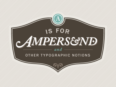
Continuing to refine based on the great feedback received. Adjusted hierarchy a bit, cleaned up some type here and there. Getting closer.
7 months ago
Pro
Zach Roszczewski
sweet badge
7 months ago
Pro
Nate Hanson
Quick idea: what do you think about switching the "is for" so that it curves around the circle shapes at the top? Basically, you would just slip the curve of the text.
?
7 months ago
Pro
Ryan Lascano
That's a good idea, Nate, I'll give it a whirl. What do you think about the A bug and the rest of the crest being separate? Should they be layered on top, like the A is a button glued on the crest (for lack of a better description)?
7 months ago
Pro
Nate Hanson
I guess I would have to see it, but I like what you have here. I think that your layout here connects all of the elements together but still has separation and a sense of hierarchy.
7 months ago