Find designers
Designer search
Quickly find your next designer
Post a job
The #1 job board for design talent
Inspiration
Courses
UX Diploma
Learn UX design from scratch in 6 months
UI Certificate
12-week UI skill building for designers
Live interactive workshops
with design professionals
Jobs
Go Pro
Log in
Dribbble: the community for graphic design
Advance your career with a Professional Diploma in UX Design
Learn more
Log in
Sign up
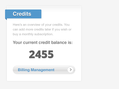
Credits sidebox
Gerasimos Tsiamalos
Follow
Following
Like
#F8F8F8
#A8A8A8
#5498CB
#A3C2D9
#666666
#4D86B1
#2F526C
#4C728E
Download color palette
blue
button
sidebar
white
View all tags
Posted on Nov 8, 2011
792
2
11
2
View feedback
Gerasimos Tsiamalos
More by Gerasimos Tsiamalos
View profile
Previous
Next
Loading…