"A" monogram

A2

5 Responses

  1. Pro Aldrich Tan Aldrich Tan

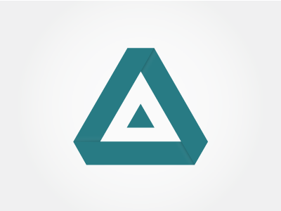
    Exploring another option for my personal logo. What do you think?

    I'm sure the shape has been done before, but thats not a bad thing. Its the execution is what I am more concerned about!

    Feedback please and thank you!

    over 1 year ago

  2. over 1 year ago

  3. Pro Carlos Fernandez Carlos Fernandez

    Very cool! I like it a lot! Where the pieces overlap, have you tried making the shadow longer? The shadow as small as it is now might get hard to see when the logo is reproduced small. Plus a longer shadow may give it some drama.. Those are my thoughts. :) Looking very cool!!

    likes

    over 1 year ago

  4. Pro Aldrich Tan Aldrich Tan

    Thanks Carlos! did you get a look at the other two? which do you prefer? :)

    over 1 year ago

  5. Pro Carlos Fernandez Carlos Fernandez

    I like this one with the triangle best. :)

    over 1 year ago

keyboard shortcuts: previous shot next shot L or F like