Todo tab app - OSX

Todo_app_2

1 Attachment

33 Responses (page 1 of 2)

  1. Pro Jonathan Moreira Jonathan Moreira

    This is a preview of a little app I'm developing between clients projects.

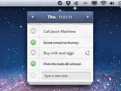
    To explain quickly the concept: it's a tiny tab app that permits to manage little tasks without having to use big screens and tons of features. Quick and easy access to add/edit/delete and check daily tasks.

    I'm always working on the design, so don't hesitate to tell what you think. Thanks!

    Here's a bigger preview

    And also thanks to Jeremy Sallée for the great feedback.

    likes

    over 1 year ago

  2. Pro Eric Hoffman Eric Hoffman

    very cool!

    likes

    over 1 year ago

  3. Pro Johan Geijer Johan Geijer

    I really really dig this, small and simple is awesome!

    The one and only thing that I wasnt sure about was the indicators on the reminders (red-green dots) , I would make them less glowing and more into the sofisticated style used in the top bar.

    Overall I think this is sleek and sexy though, and I have been jumping from bar to bar the last 4 hours, so my judgement might be questionable. Anyways, great work as usual Jonathan!

    likes

    over 1 year ago

  4. Bruno Lazzaro Bruno Lazzaro

    I love the detail at the bottom, just great.

    likes

    over 1 year ago

  5. Pro Anton Kudin Anton Kudin

    looking great! :)
    i would pay top dollar for this application!
    (but maximum of three)

    likes

    over 1 year ago

  6. Anthony Fonte Anthony Fonte

    Very cool, I agree with Johan that compact is the way to go. Nice detail with the pages behind it on the bottom. I don't think there is really a better way to indicate that a task is either overdue or completed... maybe a compromise is that they don't glow? Just solid color instead.

    likes

    over 1 year ago

  7. Pro Brad Haynes Brad Haynes

    Just saw this today, very similar approach: http://overcommitted.com/tictoc/

    over 1 year ago

  8. Pro Wil Nichols Wil Nichols

    Also, very similar to my Diligence UI work. >>

    likes

    over 1 year ago

  9. CDY CDY

    I like this app!
    One suggestion is that: all the finished task can go down to gather at the bottom of the list.

    likes

    over 1 year ago

  10. skfan skfan

    nice work!

    likes

    over 1 year ago

  11. Pro Kreativa Studio Kreativa Studio

    Very nice idea.

    likes

    over 1 year ago

  12. Pro zee7 ✽ zee7 ✽

    great as usual my friend :)

    likes

    over 1 year ago

  13. Pro Jonathan Moreira Jonathan Moreira

    Thanks guys for the feedback!

    @Brad, I never heard about this application before you pointed it out. I believe this little app concept isn't as original I thought. ;)

    @Wil, to be honest this makes several month I started building this app. I've already made several iterations on the design that are quite similar to this one, and unfortunately to your design... So, it is a kind of coincidence if mine has some similarities with yours.

    over 1 year ago

  14. Pro Jonatan Littke Jonatan Littke

    @Jonathan: TicToc is a time tracking app, and I really find it different than what yours appears to be.

    Care syncing this with Reminders in iCloud or Tasks in Gmail? :) Would be awesome if possible.

    likes

    over 1 year ago

  15. Pro Jonathan Moreira Jonathan Moreira

    Yea that would be a great feature, for sure! Someone else said me the same yesterday. Maybe it would worth taking time implementing it. Thanks Jonatan :)

    over 1 year ago

  16. Pro borislav borislav

    great work, I just think that the under pages on the bottom are too much, for me just one or two will look better. And the stroke on the bottom of the blue box (the date) is too much gray, maybe a dark blue color will be better :)

    likes

    over 1 year ago

  17. Pro Jonathan Moreira Jonathan Moreira

    That's fun you're saying that because I already removed some under pages (they were about 6-7 in the last iteration) Someone pointed the fact that it could be overwhelming having all that sheets behind, and that's quite true! For the stroke, good point, will try out. Thanks borislav!

    likes

    over 1 year ago

  18. Pro Vasjen Katro Vasjen Katro

    Love the details!

    likes

    over 1 year ago

  19. Pro Jonathan Moreira Jonathan Moreira

    Thanks Vasjen! :)

    over 1 year ago

  20. Pro Crowded Road Crowded Road

    Awesome.. show us more! :)

    likes

    over 1 year ago

  21. Pro Jonathan Moreira Jonathan Moreira

    Thanks mate, I'll for sure!

    over 1 year ago

  22. Megan Hutchinson Megan Hutchinson

    love it! looks really great!

    likes

    over 1 year ago

  23. Pro Jonathan Moreira Jonathan Moreira

    Thank you Megan, I'm glad you like it! :)

    over 1 year ago

  24. Pro Guillaume Gaubert Guillaume Gaubert

    I don't really like the check dots, there is too depth and this contrast with the realistic paper. I'd go for a kind of a written checked symbol.
    The top bar is kind of weird to me, maybe because of the color and the white inner shadow gets too much size to me.
    I think it'd fits better if the alarm glyph was embossed in the paper and black.
    Also, I'd remove one paper stack at the bottom, it currently looks too much to me.
    Otherwise great texture and gorgeous torn paper!

    likes

    over 1 year ago

  25. Bryan Le Bryan Le

    Jen and I have been waiting for you to call.

    likes

    over 1 year ago

keyboard shortcuts: previous shot next shot L or F like