I got distracted

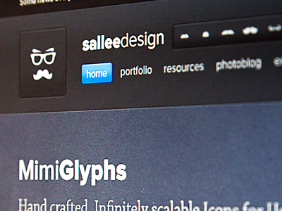

I was working on the upcoming page for the release of mimiglyphs v2. And of course, like every time I work on my site I got distracted by other elements and decided to very slightly modify my header. Give it more room to breath especially.
If you have any opinion about if I should change my header to this, I'll be happy to know.
Also if you have any opinion about the mimiGlyph presentation, I'll be happy to know too ;)


