LOGO REVAMP 2

A personal project I did on revising logos in our town.
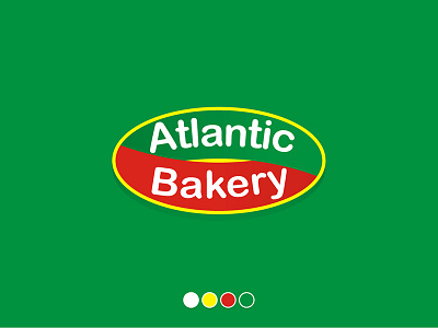
this is a logo I did for a bread company running for over 50 years already. I've won an ad competition for this bakery and I decided to make a spin on their logo. My goal was to modernize the logo embedding the ideals that it is owned by a Chinese family, the former colors should still remain but should be more organized and appealing. It should deal with health and quality.
I made an infinity loop inside the original ellipse they had to show their Chinese belief of longevity, I placed green above to showcase health, and red below to show luck. Yellow is the company's main color symbolizing happiness in every bite. but on my spin, I took it as an accent due to the fact that I want their brand to represent a new look that has survived and is already a part of my town's heritage.I also used their original font to trace back their original word-mark.
Check out the full project here
10 DAYS 10 LOGOS


