I really like the background. I like the logo as well. The buttons feel a bit over the top, maybe the texture can be more subtle. But that just may be what you were going for.
The buttons actually tie-in to some of the texture in one of the game's themes. I struggled with that a bit myself, but after seeing it on-screen it felt pretty okay :)
5 Responses
Pro
Ryan Brock
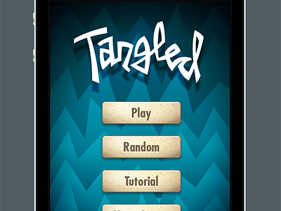
Final menu art for a visual redesign of a fun puzzle game for iOS called Tangled. Check out the full view!
7 months ago
I really like the background. I like the logo as well. The buttons feel a bit over the top, maybe the texture can be more subtle. But that just may be what you were going for.
7 months ago
Pro
Ryan Brock
The buttons actually tie-in to some of the texture in one of the game's themes. I struggled with that a bit myself, but after seeing it on-screen it felt pretty okay :)
7 months ago
Love that logo and the colours
7 months ago
ah i see...yeah i haven't seen the rest of the app so didn't know what was possible but uniformity makes sense, the colors also go great together.
5 months ago