Find designers
Designer search
Quickly find your next designer
Post a job
The #1 job board for design talent
Inspiration
Courses
UX Diploma
Learn UX design from scratch in 6 months
UI Certificate
12-week UI skill building for designers
Live interactive workshops
with design professionals
Jobs
Go Pro
Log in
Dribbble: the community for graphic design
Advance your career with a Professional Diploma in UX Design
Learn more
Log in
Sign up
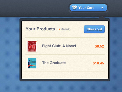
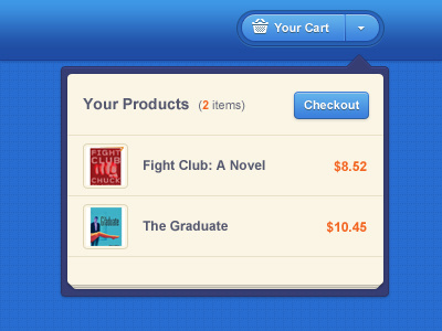
Cart Dropdown - final version
Ionut Zamfir
Available for work
Follow
Following
Like
Get in touch
#FAF4E4
#39414D
#5887B7
#4870A1
#395C8D
#4D9CDF
#B4B2B1
#C04A3E
Download color palette
Here's the final version :)
Update
: Fixed the shadow (check the attachement)
Rebound of
Cart Dropdown
By
Ionut Zamfir
blue
cart
dropdown
ecommerce
modern
shop
View all tags
Posted on Oct 27, 2011
7,599
44
158
29
View feedback
Ionut Zamfir
Freelance designer with a huge passion for clean interfaces.
Get in touch
More by Ionut Zamfir
View profile
Previous
Next
Loading…
Loading…
Loading…