Find designers
Designer search
Quickly find your next designer
Post a job
The #1 job board for design talent
Inspiration
Courses
UX Diploma
Learn UX design from scratch in 6 months
UI Certificate
12-week UI skill building for designers
Live interactive workshops
with design professionals
Jobs
Go Pro
Log in
Dribbble: the community for graphic design
Log in
Sign up
Footer Promotion
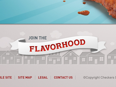
Lindsay Mindler
Follow
Following
Like
#D9D4D4
#BAB2B3
#90CDD8
#69B8C7
#AB402E
#605F5C
Download color palette
Posted on Jun 23, 2010
12,530
10
128
8
View feedback
Lindsay Mindler
More by Lindsay Mindler
View profile
Previous
Next
Loading…