Find designers
Designer search
Quickly find your next designer
Post a job
The #1 job board for design talent
Inspiration
Courses
UX Diploma
Learn UX design from scratch in 6 months
UI Certificate
12-week UI skill building for designers
Live interactive workshops
with design professionals
Jobs
Go Pro
Log in
Dribbble: the community for graphic design
Log in
Sign up
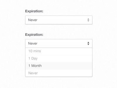
Expiration
Orman Clark
Follow
Following
Like
#FCFCFC
#BFC0C3
#63646A
#A2A2A6
Download color palette
A lil something.
drop down
menu
select menu
View all tags
Posted on Oct 24, 2011
14,443
38
212
7
View feedback
Orman Clark
LemonSqueezy․com + PremiumPixels․com + Dunked․com ✌️
More by Orman Clark
View profile
Previous
Next
Loading…