


Fitbit Box 1
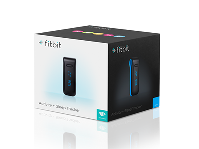
This was a packaging design exploration I started a few months ago. I nixed it for several reasons, and we ended up using an outside vendor to design our latest packaging. But I decided to finish up the concept this weekend. I still like it, but it's probably impractical for a number of reasons.


