Find designers
Designer search
Quickly find your next designer
Post a job
The #1 job board for design talent
Inspiration
Courses
UX Diploma
Learn UX design from scratch in 6 months
UI Certificate
12-week UI skill building for designers
Live interactive workshops
with design professionals
Jobs
Go Pro
Log in
Dribbble: the community for graphic design
Log in
Sign up
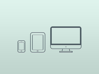
Device Icons
William Duijzer
Available for work
Follow
Following
Like
Get in touch
#CFE4DD
#BFD4CD
#4C5C62
#6F7D83
#96A5A6
#AFC3BF
Download color palette
Icons for a pitch we're working on.
device
icon
imac
ipad
iphone
View all tags
Posted on Oct 18, 2011
3,200
6
49
6
View feedback
William Duijzer
Founder & Creative Director Wild Digital
Get in touch
More by William Duijzer
View profile
Previous
Next
Loading…
Loading…
Loading…