Find designers
Designer search
Quickly find your next designer
Post a job
The #1 job board for design talent
Inspiration
Courses
UX Diploma
Learn UX design from scratch in 6 months
UI Certificate
12-week UI skill building for designers
Live interactive workshops
with design professionals
Jobs
Go Pro
Log in
Dribbble: the community for graphic design
Advance your career with a Professional Diploma in UX Design
Learn more
Log in
Sign up
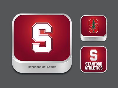
Stanford Athletics App Icons
Daniel Mack
Follow
Following
Like
#555658
#971228
#760A22
#E6E5E5
#B4ACAE
#C1353C
#B77885
Download color palette
Icons that I created for Stanford University App
created at Taqtile / @indigoapps
app
artwork
icon
iphone
stanford
ui
View all tags
Posted on Oct 17, 2011
724
2
8
2
View feedback
Daniel Mack
More by Daniel Mack
View profile
Previous
Next
Loading…