Find designers
Designer search
Quickly find your next designer
Post a job
The #1 job board for design talent
Inspiration
Courses
UX Diploma
Learn UX design from scratch in 6 months
UI Certificate
12-week UI skill building for designers
Live interactive workshops
with design professionals
Jobs
Go Pro
Log in
Dribbble: the community for graphic design
Advance your career with a Professional Diploma in UX Design
Learn more
Log in
Sign up
Social Login
Thomas Norsted
Follow
Following
Like
#A8B6BF
#DCE4E8
#367395
#2D4F63
#5AA5BD
#817F7F
Download color palette
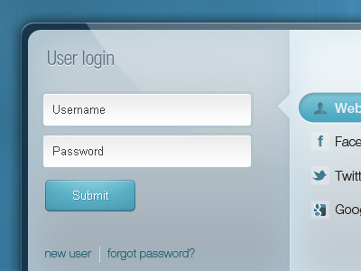
Part of a login box with various ways of logging in
form
login
modal
social
ui
View all tags
Posted on Oct 13, 2011
1,174
3
10
4
View feedback
Thomas Norsted
More by Thomas Norsted
View profile
Previous
Next
Loading…