Find designers
Designer search
Quickly find your next designer
Post a job
The #1 job board for design talent
Inspiration
Courses
UX Diploma
Learn UX design from scratch in 6 months
UI Certificate
12-week UI skill building for designers
Live interactive workshops
with design professionals
Jobs
Go Pro
Log in
Dribbble: the community for graphic design
Log in
Sign up
Calendar
Pontus Johansson
Follow
Following
Like
#39454F
#FBFBFB
#444F58
#A73836
#CDB395
#C6A074
#372529
Download color palette
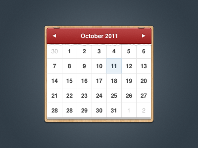
A simple calendar.
blue
cal
calendar
date
datepicker
gui
ical
interface
paper
picker
red
texture
time
ui
user
wood
wooden
View all tags
Posted on Oct 11, 2011
24,192
42
326
18
View feedback
Pontus Johansson
More by Pontus Johansson
View profile
Previous
Next
Loading…