Find designers
Designer search
Quickly find your next designer
Post a job
The #1 job board for design talent
Inspiration
Courses
UX Diploma
Learn UX design from scratch in 6 months
UI Certificate
12-week UI skill building for designers
Live interactive workshops
with design professionals
Jobs
Go Pro
Log in
Dribbble: the community for graphic design
Advance your career with a Professional Diploma in UX Design
Learn more
Log in
Sign up
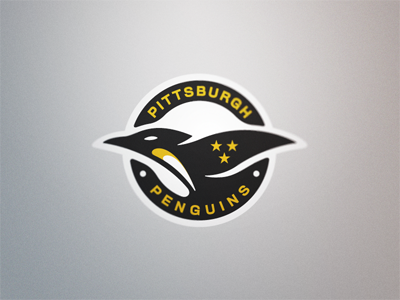
Pittsburgh Penguins Logo Concept
Fraser Davidson
Available for work
Follow
Following
Like
Get in touch
#ADADAF
#D8D7D7
#252526
#5D5643
#CBAA26
Download color palette
A 10 minute idea I had while rendering.
concept
hockey
ice
logo
penguins
pittsburgh
sports
View all tags
Posted on Oct 11, 2011
7,177
31
180
22
View feedback
Fraser Davidson
Designer & Animator
Get in touch
More by Fraser Davidson
View profile
Previous
Next
Loading…
Loading…
Loading…