7ac5582c443711e19e4a12313813ffc0_7

Payment Schedule

Admin_11

9 Responses

  1. Pro 7ac5582c443711e19e4a12313813ffc0_7 Ryan Clark

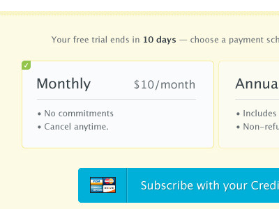
    Working on a way to toggle between our payment schedule options. Does this look "selected" enough compared to the other one? And the big button is by my pal, Josh, so I can't take credit for that awesomeness.

    8 months ago

  2. Face Allen Tan

    I think the green check mark could be made more prominent. Looks great otherwise!

    8 months ago

  3. Pro Screen_shot_2011-02-04_at_3 matt

    maybe make it more prominent by moving it to the bottom right to fill some of the dead space better.

    likes

    8 months ago

  4. Pro Alpis-new-avatar Alpis Design

    Clean, useful & effective :)

    8 months ago

  5. Pro 7ac5582c443711e19e4a12313813ffc0_7 Ryan Clark

    I'll try those suggestions out. Thanks!

    8 months ago

  6. Moitwitter Ryan Meashaw

    I like the above suggestions... In addition, might be nice to change the border of the selected box to the green color.

    8 months ago

  7. Pro Avatar Alan Horne

    You could maybe make the tick-box larger and bottom right? there seems plenty of space to play with down there.

    8 months ago

  8. Glasses Chance Graham

    Green border.

    likes

    8 months ago

  9. Pro Cresk_avatar Gert van Duinen

    Sexy

    8 months ago

keyboard shortcuts: previous shot next shot L or F like