Find designers
Designer search
Quickly find your next designer
Post a job
The #1 job board for design talent
Inspiration
Courses
UX Diploma
Learn UX design from scratch in 6 months
UI Certificate
12-week UI skill building for designers
Live interactive workshops
with design professionals
Jobs
Go Pro
Log in
Dribbble: the community for graphic design
Log in
Sign up
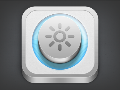
Let there be light...
Mario Bieh
Follow
Following
Like
#3A3B3C
#DEE0E0
#A8A8A9
#5EA4C1
#A0D5EA
#4C7A87
Download color palette
app
icon
iphone
View all tags
Posted on Oct 7, 2011
2,264
6
52
2
View feedback
Mario Bieh
More by Mario Bieh
View profile
Previous
Next
Loading…