Download Bootstrap 3 Grid PSD

With the new Bootstrap 3 grid you have gutter width and column width different from the ones in Bootstrap 2, and the container width includes two half gutter padding on the sides. Also, in each breakpoint, the columns have uneven width since they are set by percentages, and the width of the container doesn’t match perfectly with even width.
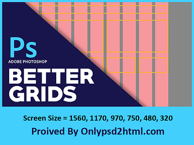
In the download above you can find the grid templates for the three main breakpoints of bootstrap 3 (1170px, 970px, 750px), plus two grids for mobile (480px, 320px), all with the default 30px gutter. Also included the retina versions.
On the mobile grids (480px, 320px) the minimum column size is col-xs-2, because col-xs-1 breaks the grid in the browser with a viewport of 320px.
Download Link : http://www.onlypsd2html.com/blog/bootstrap-3-responsive-grid-photoshop-templates-psd/


