Find designers
Designer search
Quickly find your next designer
Post a job
The #1 job board for design talent
Inspiration
Courses
UX Diploma
Learn UX design from scratch in 6 months
UI Certificate
12-week UI skill building for designers
Live interactive workshops
with design professionals
Jobs
Go Pro
Log in
Dribbble: the community for graphic design
Weekly Warm-Up is BACK! 🎞
Rebound your shot by June 9th to participate
Log in
Sign up
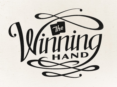
The Winning Hand
Seth Nickerson
Available for work
Follow
Following
Like
Get in touch
#F1EDE6
#1A1918
#C4C1BB
#5E5C58
#A6A39F
#43413C
Download color palette
A work in progress that's a bit outside my comfort zone. Suggestions?
cards
lettering
script
type
typography
View all tags
Posted on Oct 5, 2011
2,500
10
108
19
View feedback
Seth Nickerson
Branding, design, type, illustration. Always hungry. ✌
Get in touch
More by Seth Nickerson
View profile
Previous
Next
Loading…
Loading…
Loading…