Find designers
Designer search
Quickly find your next designer
Post a job
The #1 job board for design talent
Inspiration
Courses
UX Diploma
Learn UX design from scratch in 6 months
UI Certificate
12-week UI skill building for designers
Live interactive workshops
with design professionals
Jobs
Go Pro
Log in
Dribbble: the community for graphic design
Log in
Sign up
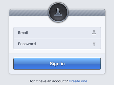
Rule.fm Sign In
Dalton Woods
Follow
Following
Like
#E7EAF0
#ABBBCF
#4077D6
#979FAD
#649CE2
#837E7C
#2E2F33
Download color palette
account
email
form
login
password
sign in
View all tags
Posted on Oct 4, 2011
7,451
16
136
13
View feedback
Dalton Woods
More by Dalton Woods
View profile
Previous
Next
Loading…