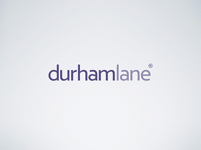
durhamlane Logotype
The new durhamlane logotype is a modification of the beautiful Verlag typeface from Hoefler & Co. After much deliberation the ascenders of Verlag were too tall and caused the logotype to appear unbalanced. Reducing the ascender height lead to a well balanced, strong but personable impression of this North East sales performance firm.
Posted on
Jul 18, 2016
More by David Todd View profile
Like


