Find designers
Designer search
Quickly find your next designer
Post a job
The #1 job board for design talent
Inspiration
Courses
UX Diploma
Learn UX design from scratch in 6 months
UI Certificate
12-week UI skill building for designers
Live interactive workshops
with design professionals
Jobs
Go Pro
Log in
Dribbble: the community for graphic design
Weekly Warm-Up is BACK! 🎞
Rebound your shot by June 9th to participate
Log in
Sign up
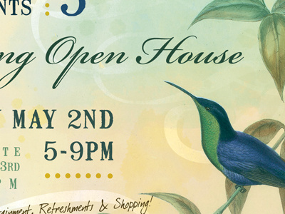
Open House
Ryan Meashaw
Follow
Following
Like
#E1E6CB
#E3DEB1
#A4B995
#999B65
#275058
#3A5845
#659067
#5B7B83
Download color palette
Older project - flyer for an Open House
blue
flyer
green
hummingbird
print
View all tags
Posted on Oct 3, 2011
1,121
1
12
6
View feedback
Ryan Meashaw
More by Ryan Meashaw
View profile
Previous
Next
Loading…