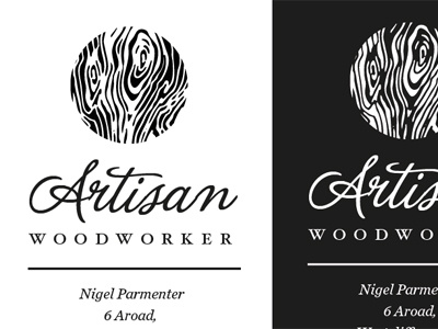
Logo + Letterhead for Dad's business

Dribbble

10 Responses

  1. Pro Gavin Elliott Gavin Elliott

    Lovely work, Sarah. :-)

    over 1 year ago

  2. Pro Dan Rubin Dan Rubin

    I love it — the woodgrain feels like an echo of a thumbprint, too, which is a nice nod to the handmade aspect of the work (and the 'mark' of an artisan, too).

    likes

    over 1 year ago

  3. Pro Kristen Grote Kristen Grote

    Can I just point out how freaking adorable it is that your dad's name is Nigel?

    likes

    over 1 year ago

  4. Michael Parenteau Michael Parenteau

    Reminds me of a wood grain like thumbprint... really beautiful work!

    over 1 year ago

  5. Pro Alpis Design Alpis Design

    Nice work Sarah :)

    over 1 year ago

  6. Nik Gill Nik Gill

    Lovely! Needs some work where the capital A and the r meet so its not so disjointed, but lovely work

    likes

    over 1 year ago

  7. Tony Geer Tony Geer

    Looks nice. But I think the A-r and the a-n need some work, they're not joining up well at all.

    over 1 year ago

  8. Luke Alford Luke Alford

    Love it! , working for family can some times be awesome because they give you creative freedom =D

    over 1 year ago

  9. Pro Ryan Hamrick Ryan Hamrick

    Lovely type! Very welcoming visuals.

    over 1 year ago

  10. over 1 year ago

keyboard shortcuts: previous shot next shot L or F like