Find designers
Designer search
Quickly find your next designer
Post a job
The #1 job board for design talent
Inspiration
Courses
UX Diploma
Learn UX design from scratch in 6 months
UI Certificate
12-week UI skill building for designers
Live interactive workshops
with design professionals
Jobs
Go Pro
Log in
Dribbble: the community for graphic design
Log in
Sign up
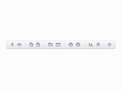
Documents Toolbar
Benjamin De Cock
Follow
Following
Like
#FBFBFB
#BBC3CD
#99A1AC
#727A87
Download color palette
icons
View all tags
Posted on Oct 3, 2011
13,739
41
464
21
View feedback
Benjamin De Cock
More by Benjamin De Cock
View profile
Previous
Next
Loading…