Yeah, this could do with a little more depth. The corners on the buttons seem a little sharp at the beginning and ends of the curve but maybe that's just me. Looking good though! Is this client work or just something personal?
@Michaël Villar You really have to see the whole thing together, I'll admit it looks a little flat is misplaced in this preview, but it comes to life on iPad.
11 Responses
Pro
Louis Harboe
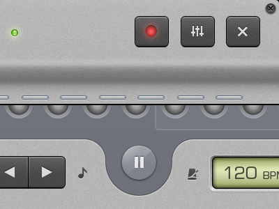
Two little sections from a redesign of an iPad app. Trying to imitate a full sized mixer, on a touch screen.
over 1 year ago
Great!
over 1 year ago
Pro
Dan Cederholm
That note icon is just perfect (among other things).
over 1 year ago
I enjoyed looking at this.
over 1 year ago
Pro
James Gill
It actually feels like I can reach out and feel these buttons. Agree with @Dan, that note icon is spot on. Great stuff.
over 1 year ago
Pro
Louis Harboe
Thanks guys. Oh and before you comment on the metronome icon, note that it was heavily inspired by garageband...
over 1 year ago
Pro
Jonatan Castro
Looks really nice man!
over 1 year ago
I'm not a fan of this one. Look really flat to me? I don't really understand the overall. Waiting for the next iteration:p
over 1 year ago
Yeah, this could do with a little more depth. The corners on the buttons seem a little sharp at the beginning and ends of the curve but maybe that's just me. Looking good though! Is this client work or just something personal?
over 1 year ago
Pro
Louis Harboe
@Michaël Villar You really have to see the whole thing together, I'll admit it looks a little flat is misplaced in this preview, but it comes to life on iPad.
over 1 year ago
@Louis hope to see the whole thing very soon then !
over 1 year ago