Thanks, gents. The "C" is a bit weird for sure. I originally had it as a pretty straight-forward half-circle, but I thought it felt too rigid. This is only preliminary so if they like it I will attack that "C" again.
I read 'red' on the first line, something to do with the red c and it kind of being a backwards 'D.' I think you can mess with that shape system and get a better C. Also I second @Jen that you should do this by hand if they go with it. That slight imperfection will totally make it.
11 Responses
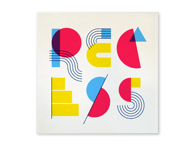
Trying my damndest to channel Kandinsky and Rand, I think perhaps falling short though.
Legible? Readable?
8 months ago
Pro
Taylor Goad
Only letter I'm struggling with is the "C".
8 months ago
Recess, and I love it. The 'C' is a bit difficult, but the rest are perfect, that 'R' especially. Awesome job, sir.
8 months ago
Thanks, gents. The "C" is a bit weird for sure. I originally had it as a pretty straight-forward half-circle, but I thought it felt too rigid. This is only preliminary so if they like it I will attack that "C" again.
8 months ago
Algebraic!
8 months ago
Totally legible, I had no issue with the C. I dare you to really go for Kandinksy and get out some paint to make those color shapes!
8 months ago
@Jen — I was thinking I would actually do that if the guys go for this option. It would be difficult to scan/photograph it but I think maybe worth it.
8 months ago
Pro
Elias Stein
Looking good, Andy!
8 months ago
Pro
Bryan Connor
I read 'red' on the first line, something to do with the red c and it kind of being a backwards 'D.' I think you can mess with that shape system and get a better C. Also I second @Jen that you should do this by hand if they go with it. That slight imperfection will totally make it.
8 months ago
I know this is super late but I'm really digging this man.
8 months ago
Pro
Dan Brindley
incredible.
5 months ago