Find designers
Designer search
Quickly find your next designer
Post a job
The #1 job board for design talent
Inspiration
Courses
UX Diploma
Learn UX design from scratch in 6 months
UI Certificate
12-week UI skill building for designers
Live interactive workshops
with design professionals
Jobs
Go Pro
Log in
Dribbble: the community for graphic design
Log in
Sign up
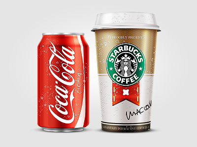
Coke Coffe wip
Claudio Guglieri
Follow
Following
Like
#E8E7E7
#C8B6A4
#D7271B
#312F23
#D56146
#A60C09
#BE9669
#1A966B
Download color palette
brown
can
cocacola
cup
drink
mug
red
starbucks
View all tags
Posted on Oct 2, 2011
14,839
33
483
30
View feedback
Claudio Guglieri
More by Claudio Guglieri
View profile
Previous
Next
Loading…