


How do you align your button text?

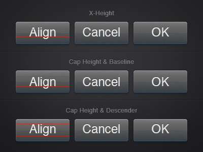
Centre Based on X-Height
Looks great for text with ascenders and descenders. Not so good for numbers and all caps, where there's no descenders. Looks good for "Cancel", but bad for "OK".
Centre Based on Cap Height & Baseline
Looks bad for text with ascenders and descenders. Great for numbers and all caps, where there's no descenders. Looks good for "OK", but bad for "Cancel".
Centre Based on Cap Height and Descenders
Very similar to centring on x-height. Great for text with ascenders and descenders. Not so good for numbers and all caps. Depending on the typeface, centring on cap height and descenders can vary a fair bit from x-height centring. Looks alright for "Cancel", but bad for "OK".
In this scenario, we're talking about a movement range of 3 pixels, and these buttons are quite large. Often, the movement range for the three methods can be as little as 1 pixel. Higher PPI screens are going to allow for more accuracy, which means most of us will need to make a firm decision.
My personal preference is usually x-height with initial caps text, and cap height & baseline when you know all the buttons are going to be uppercase.
What about you?


