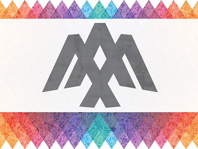
3 Arrows Digital - Logo & Brand work
3 Arrows Digital - is my new web & mobile design startup.
I was born and raised in Oklahoma and I'm a tribal member of the Choctaw Nation. For this new venture, I wanted to make a very personal mark with lots of meaning. My 3 sons (3 arrows) are always a big inspiration, so that's where I got the name. There's a reference in Psalms 127:3-5 that uses a quiver full of arrows as a simile for being blessed by a family and having children (https://www.bible.com/bible/105/psa.127).
A lot of what I do creatively is storytelling and user experience, so I worked to incorporate all of that into a symbol that would evoke feelings of joy and positive energy (or the Choctaw word yukpali).
The main components of the mark are 3 large greater than symbols. It is believed that the origin of the greater than sign is derived from or inspired by Northern American Indian people (https://en.wikipedia.org/wiki/Greater-than_sign). Since these symbols look like the point of an arrow and are used for code tags, it seemed perfect to me, so I went with it!
Overlapping the 3 "arrows" created some unique shapes. After much finessing and several iterations, I settled on a version that created a diamond shape in the center while eliciting a soaring bird — an eagle perhaps???. The diamond is an important shape in Choctaw culture that can reference mountain shapes, the diamond back rattlesnake, and an overall reverence for nature.
Even the degree of tilt for the two outer arrows have meaning. Each arrow is tilted 5 degrees away from center, representing the number of people in our family.
I believe this mark will be versatile and could even be a cool tattoo. More looks and uses of this mark to come.
Special thanks to @doyoufoster for the dribbble invite! I’m grateful and elated to finally be here!!


