Find designers
Designer search
Quickly find your next designer
Post a job
The #1 job board for design talent
Inspiration
Courses
UX Diploma
Learn UX design from scratch in 6 months
UI Certificate
12-week UI skill building for designers
Live interactive workshops
with design professionals
Jobs
Go Pro
Log in
Dribbble: the community for graphic design
Log in
Sign up
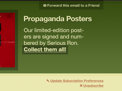
Green with propaganda
Dan Rubin
Follow
Following
Like
#51672A
#E8E6AE
#383B18
#96010A
#9B9865
#D7D4A4
#BC724A
Download color palette
I <3 simple pixel patterns.
chameleon
email
gradient
green
greenish
helvetica
helvetica neue
mailchimp
opacity
pattern
red
rgba
template
text shadow
texture
View all tags
Posted on Jun 15, 2010
2,551
1
24
8
View feedback
Dan Rubin
More by Dan Rubin
View profile
Previous
Next
Loading…