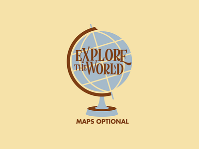
Explore The World - Take 2

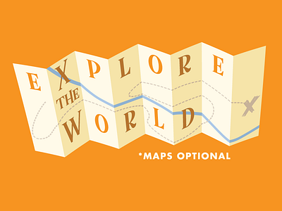
Another take at the same saying. Ditched the globe for a map, since that's the point of the illustration. Also knocked out the letters to pull through the paper or fabric color. Since this is for a shirt design, that will allow for a few options. The darker letters are just a low opacity black to give the darker appearance. Should print pretty cool.
I'll post a link to the shirt once it's available for sale.