Find designers
Designer search
Quickly find your next designer
Post a job
The #1 job board for design talent
Inspiration
Courses
UX Diploma
Learn UX design from scratch in 6 months
UI Certificate
12-week UI skill building for designers
Live interactive workshops
with design professionals
Jobs
Go Pro
Log in
Dribbble: the community for graphic design
Advance your career with a Professional Diploma in UX Design
Learn more
Log in
Sign up
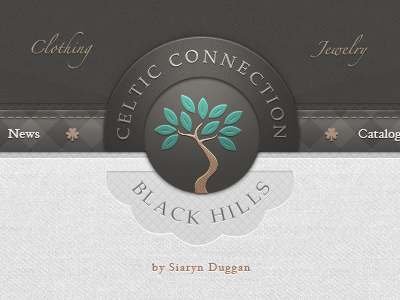
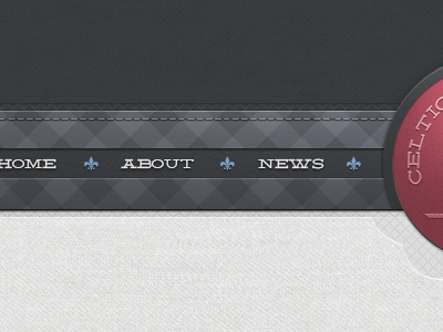
Web clothing shop menu - UI/UX interface
Jonathan Moreira
Available for work
Follow
Following
Like
Get in touch
#4F4D4A
#E1E1E1
#8A8170
#A8A7A3
#5DA699
Download color palette
Had a lot of fun working on this with all the texture work involved.
Rebound of
Clothing shop menu
By
Jonathan Moreira
celtic
cloth
fabric
irish
leaf
menu
texture
tree
View all tags
Posted on Sep 27, 2011
45,311
138
991
41
View feedback
Jonathan Moreira
Designer
Get in touch
More by Jonathan Moreira
View profile
Previous
Next
Loading…
Loading…
Loading…