Find designers
Designer search
Quickly find your next designer
Post a job
The #1 job board for design talent
Inspiration
Courses
UX Diploma
Learn UX design from scratch in 6 months
UI Certificate
12-week UI skill building for designers
Live interactive workshops
with design professionals
Jobs
Go Pro
Log in
Dribbble: the community for graphic design
Log in
Sign up
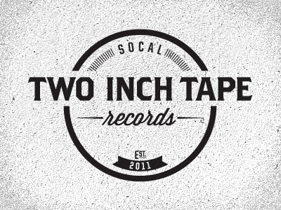
Two Inch Tape Logo 02.1
Joshua Krohn
Available for work
Follow
Following
Like
Get in touch
#ECECEC
#C0BFC0
#221E1F
#5F5E5F
#403E3F
Download color palette
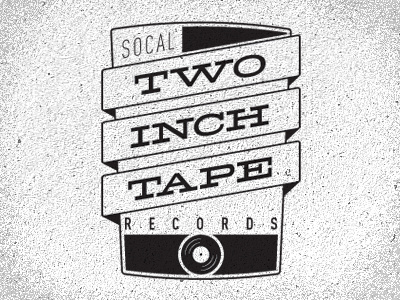
And the other direction all vectorized. Your thoughts would be most welcome.
Rebound of
Two Inch Tape Logo 01.1
By
Joshua Krohn
logo
wip
View all tags
Posted on Sep 25, 2011
2,693
11
116
8
View feedback
Joshua Krohn
Get in touch
More by Joshua Krohn
View profile
Previous
Next
Loading…
Loading…
Loading…