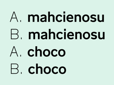
One Step Forward And Two Steps Back
That’s what I like in type design, always going one step forward and two steps back and then three steps forward again:
working on an Akidenz Grotesk like font, started with a closed "c", developed it to a more open shape and ended with the closed version again.
More by Jakob Runge View profile
Like


