Find designers
Designer search
Quickly find your next designer
Post a job
The #1 job board for design talent
Inspiration
Courses
UX Diploma
Learn UX design from scratch in 6 months
UI Certificate
12-week UI skill building for designers
Live interactive workshops
with design professionals
Jobs
Go Pro
Log in
Dribbble: the community for graphic design
Advance your career with a Professional Diploma in UX Design
Learn more
Log in
Sign up
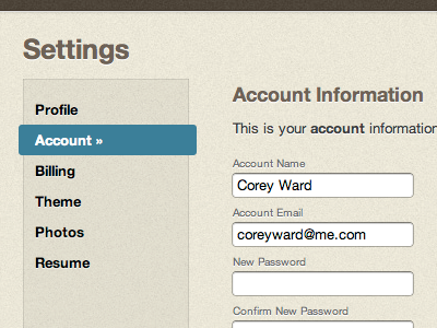
Account Settings
Corey Ward
Follow
Following
Like
#E9E6D9
#DACCB0
#ACB4AD
#3C7D99
#4E4439
#716961
#90877C
#292429
Download color palette
beige
blue
css3
form
horizontal
html
inputs
tabs
warm
View all tags
Posted on Jun 14, 2010
2,310
3
7
3
View feedback
Corey Ward
More by Corey Ward
View profile
Previous
Next
Loading…