Material Redesigns

Last year I started getting into UI. My stance is that Apple's "flat design" suits non-touchscreen designs and Google's "material design" principles are better for touchscreen design.
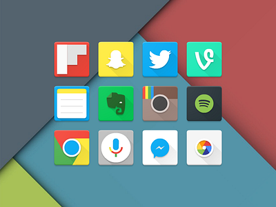
I redesigned a bunch of popular app icons to practice material design. I'm not happy with the larger-bodied icons such as Flipboard, Notes and Google Now, but these are my untouched first attempts from 2015 (hence the old Instagram style).
EDIT: Back then I also wasn't a fan of adding tint/shine onto body objects. It felt a bit too 90s.


