

Everyone is talking about the Instagram rebrand and, as with all radical redesigns, a lot of people are reeling from the change. I think it's important to recognize the huge amount of work it must have taken to ship it and I tip my hat to the monumental task the Instagram design team have tackled (seriously, just look at this video https://vimeo.com/166138104). I'm generally not a fan of unsolicited second-takes from people who were not in the room when the brief was discussed but it's hard not to play around with the new visuals – particularly when it's an app most of us use and love – so take this as pure fun, just conversation and absolutely no disrespect meant.
I'm liking the new squircle within a squircle, and while i understand why they want to move away from the old-timey look and towards a grander abstraction, it's kind of sad to see most of the character of the brand washed away. While I'm sure we'll get used to the gradient, it comes off as quite 'loud' and, dare i say, a little generic. It'll be interesting to see how well it'll age.
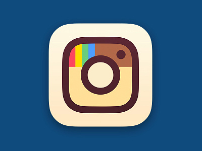
I wanted to see what a fusion between the aspects of the new icon that I like and the character of the old icon would look like. I'm not sure it's better – maybe it's just my way of coping with the loss of my instant-camera on my homescreen 😄
___
Get My Industry Standard Design Resources
at 📐👉 applypixels.com
Premium Evolving Icon & UI templates (& a bunch of freebies)


