Find designers
Designer search
Quickly find your next designer
Post a job
The #1 job board for design talent
Inspiration
Courses
UX Diploma
Learn UX design from scratch in 6 months
UI Certificate
12-week UI skill building for designers
Live interactive workshops
with design professionals
Jobs
Go Pro
Log in
Dribbble: the community for graphic design
Log in
Sign up
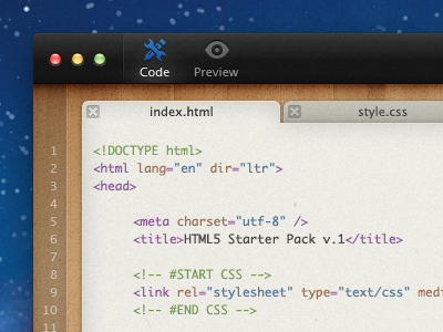
Coding App Mockup
Matthew Skiles
Available for work
Follow
Following
Like
Get in touch
#EBEAE2
#113669
#202020
#976F49
#B6B4AA
#B08E63
#40638E
#3F4551
Download color palette
Just finished mocking up a Coding App.
Check the fullsize and the other views:
dvq.co.nz/coding-app
coding app
dark
mac os x
ui
wood
View all tags
Posted on Sep 17, 2011
39,080
84
797
67
View feedback
Matthew Skiles
Get in touch
More by Matthew Skiles
View profile
Previous
Next
Loading…
Loading…
Loading…