Phew, at first I thought this was the actual page, but then I visited the page. I like the minimal feel of it all. However, the pencil seems to distract me and bring my vision back to the top of the page. Users nowadays don't really read webpages, they scan them. I'd suggest making the pencil monochrome, as this will fatigue the visitors eyes sooner than later.
Source: UX (pardon the pun) experience. Welcome to dribbble, I hope you can enrich the community.
2 Responses
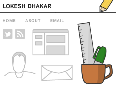
These are some of the graphics from my new personal site. Mostly monochrome with some flourishes of color for the illustrations.
Content is still very stale, but check again next week: http://lokeshdhakar.com
9 months ago
Phew, at first I thought this was the actual page, but then I visited the page. I like the minimal feel of it all. However, the pencil seems to distract me and bring my vision back to the top of the page. Users nowadays don't really read webpages, they scan them. I'd suggest making the pencil monochrome, as this will fatigue the visitors eyes sooner than later.
Source: UX (pardon the pun) experience. Welcome to dribbble, I hope you can enrich the community.
8 months ago