Web_deals

17 Responses

  1. Pro Frantisek Kusovsky Frantisek Kusovsky

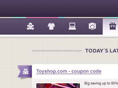
    Please note that those nice icons are from Symbolicons pack :) After some feedback im gonna to change more things, but i just wanted to share this one ;)

    likes

    over 1 year ago

  2. Regina Casaleggio Regina Casaleggio

    Very nice detail. Love the purple. Not so sure about the underlinement of the title. Think you could do without it, will add to the cleanliness of the site.

    over 1 year ago

  3. Pro Matt Anderson Matt Anderson

    This is great dude!.. Just a small nit pick, i take it the present is the hover state?.. Maybe a small shadow or something to seperate it from the bottom border.

    @Regina and you talking about the multicolored strip? Agreed i think it need to go or be changed, it just feels out of place...

    over 1 year ago

  4. Pro Ted Goas Ted Goas

    I agree with Regina: Nice use of purple, but the underlined link deviates from the delicate feel in the rest of the design. Any way to make it thinner? Say use border-bottom: 1px instead of text-decoration: underline?

    likes

    over 1 year ago

  5. Steve Schoger Steve Schoger

    I don't always like purple on a ui. But when I do, I see it on Dribbble.

    likes

    over 1 year ago

  6. Regina Casaleggio Regina Casaleggio

    I like the multicoloured strip, maybe without the drop shadow.

    likes

    over 1 year ago

  7. Gaia Bonetti Gaia Bonetti

    love everything, can not find something that does not work!

    over 1 year ago

  8. Pro Mike | Creative Mints Mike | Creative Mints

    Very nice!

    over 1 year ago

  9. Tobias van Schneider ▲▲▲ Tobias van Schneider ▲▲▲

    great work Frantisek

    over 1 year ago

  10. Ivo Miguel Silva Ivo Miguel Silva

    Love the color palette!

    over 1 year ago

  11. Pro Tom Siodlak Tom Siodlak

    Beautiful!

    over 1 year ago

  12. Pro Frantisek Kusovsky Frantisek Kusovsky

    I cant believe you guys like it that much :) Thank you all for kind words and feedback.

    over 1 year ago

  13. Pro Hans van Wijk Hans van Wijk

    That purple is gorgeous! Great design.

    over 1 year ago

  14. Pro Gert Tzafa Gert Tzafa

    nice nice nice!!!

    over 1 year ago

  15. So we decided to not go with purple due to target audience. Also i cut off the zig zag and small ribbon to make overall look more clean (but maybe the zig zag should stay). The multicolored stripe color was changed too, just to match new blue color scheme.

    over 1 year ago

  16. Pro Filip Santa Filip Santa

    very nice

    about 1 year ago

  17. Pro Yummygum Yummygum

    Aah too bad you didn't go with purple in the end, this looks so good.

    7 months ago

keyboard shortcuts: previous shot next shot L or F like