Tall (Pixel) Type 5x15

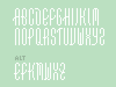
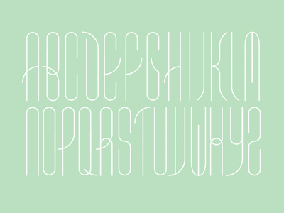
This morning's pixel calisthenics. I really dig the geometric simplicity of Greg's WIP typeface.
Some notes on my alts: I hung the bars of the E and F out to the left to echo the B. The K is a combination of the existing K and the center of the B. The middle leg of M and W borrow from the top of the D. The X was a first attempt at resolving the overlapping curves in 4px—by eliminating the overlap entirely. Baby met bathwater :) The Z has a more gradual transition from right to left with an added bar that mirrors the E and F.