Find designers
Designer search
Quickly find your next designer
Post a job
The #1 job board for design talent
Inspiration
Courses
UX Diploma
Learn UX design from scratch in 6 months
UI Certificate
12-week UI skill building for designers
Live interactive workshops
with design professionals
Jobs
Go Pro
Log in
Dribbble: the community for graphic design
Log in
Sign up
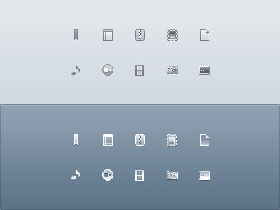
Drops Sidebar Icons
Prathyush
Follow
Following
Like
#DAE1E6
#75899C
#8A9BAC
#BBC3CC
#526271
#3A424B
Download color palette
Sidebar icons in monochrome style for
Drops app
.
archive
bookmark
code
drops
film
icons
lion
music
notes
other
pictures
sidebar
stamp
video
View all tags
Posted on Sep 15, 2011
12,927
30
213
7
View feedback
Prathyush
More by Prathyush
View profile
Previous
Next
Loading…