Find designers
Designer search
Quickly find your next designer
Post a job
The #1 job board for design talent
Inspiration
Courses
UX Diploma
Learn UX design from scratch in 6 months
UI Certificate
12-week UI skill building for designers
Live interactive workshops
with design professionals
Jobs
Go Pro
Log in
Dribbble: the community for graphic design
Log in
Sign up
search
Veerle Pieters
Available for work
Follow
Following
Like
Get in touch
#F1F4F3
#E73D4B
#A3A9A2
#A5CFD4
#46433F
#6AAAAF
#A29E5C
#63BAD4
Download color palette
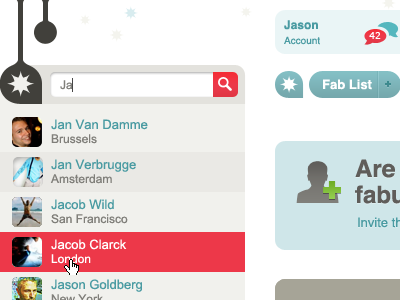
arial
beige
boxes
brown
button
coral
fab
grey
lists
menu
red
search
teal
View all tags
Posted on Jun 11, 2010
6,089
1
66
5
View feedback
Veerle Pieters
Welcome to my design portfolio on Dribbble
Get in touch
More by Veerle Pieters
View profile
Previous
Next
Loading…
Loading…
Loading…