


4up HUD

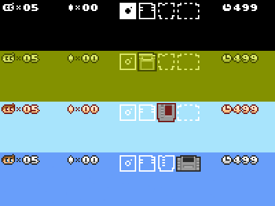
Today got mangled (slept poorly last night, workflow fractured by weather and ferrying of the misses to and from school) but I found some time to flesh out the ram carts across the different resolutions.
I revisited the HUD icons, making them more compact, and reverted to a more classic layout (lives remaining and score aren't so important that they can't be obscured by the occasional jumping thumb).


