Google Flights Usability

While showing people I work with google.com/flights today, several of them got hung up briefly after selecting their Outbound Flight. They were confused what to do next.
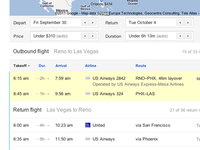
This led me to the conclusion that the 'choosing a return flight' process was derailed by the "Return Flight" being too subtle. I tried to find a fast, easy solution to the problem. This is my first attempt at making it better and more obvious.
Everyone's thoughts?
Larger and slower version here: http://up.kevinjones.co/0s450x3l1Y1Z1I0U3w0i
Note: this is all concept, i do not work for google nor is this endorsed by them or anything. just a project.


